Posted by Mary Milorrie Campos
Aug 05, 2022
Share


As humans, we like visuals because they make information easier to understand. However, not all data visualizations are the same — some are effective in simplifying complex data while some confuse the audience. So how can you ensure that you’re sending clear and digestible information to your target audience? These data visualization best practices can help.
.jpg?width=1200&name=pexels-fauxels-3183145%20(1).jpg)
Before we proceed, let’s review what data visualization is. Data visualization is the act of turning abstract data into visual representations. Among its popular examples are charts, maps graphs and diagrams.
It aims to find the connections and uncover hidden patterns between different sets of data. In application, its primary goal is to convey the data in a visual format to help more people understand the information.
What makes a good visualization?
A good data visualization is:
- Inclusive: the visualization must be accessible to different types of people, even when they’re not from your field.
- Clear: it must be direct to the point and easy to read.
- Accurate: it should also present precise and unbiased information.
- Empowering: your audience should find value in your data and should be able to make wise decisions using it.
- Descriptive: good visualization lets you pull out stories from data so you can effectively communicate insights to your audience.
Accessibility matters
So, you can understand complicated information? Here’s the thing — not everyone can. What might seem basic information to you can be a new concept to another. Not everyone has the same exposure to technical data as you do. If your stakeholders, or audience in general, cannot make sense of your visualizations, then the impact you’re trying to make can be insignificant.
Inclusive and accessible designs matter when preparing data visualizations. Through this, a wider audience can understand your graphics even when they’re not from the same team or industry.
Data visualization best practices
To ensure your graphics are accessible and inclusive, take note of these best practices in data visualization:
-
Always keep your target audience in mind
Put your audience first whenever you’re preparing data visualizations, be it for a report or the dashboard of your business intelligence software.
Who will look at this data? Why do they need the data? How can the data help in resolving your target audience’s problems?
Identify the people who need to look at your charts and graphs. Prioritize their needs and what they need to see. This alone can guide you towards creating useful visualizations.
-
Start with a clean slate
Accurate data makes a good visualization. This means your data must be clean and free of incomplete, incorrect, and irrelevant information. Bad data can affect how information appears on your dashboard and reports. It can even show you inaccurate information that may lead to poor decisions. If you’re dealing with such kind of data, make sure to conduct data cleaning first.
After cleaning your database, set the types of metrics and key performance indicators (KPIs) you need to track. Doing so will help you determine the ideal visualization tools you use.
-
Design for accessibility and inclusivity
Data visualization is the art of communicating information using visual means. Like other communication tools, it’s only effective when the end receivers can understand its message. Thus, designing for accessibility and inclusivity is crucial.
To achieve this, take note of these data visualization best practices for accessibility and inclusivity:
-
- Use colorblind-safe color palettes (more on this in data visualization best practice #4)
- Use “alt tags” in your visualizations. Alt tags refer to the text used to describe the contents of an image. Screen reader software read alt text for users with visual impairments, so make it a habit to use concise, accurate and detailed descriptions in your visualizations.
- Use appropriate font styles (e.g., sans-serif for chart titles)
- Highlight the main points and key takeaways of the data.
- Consider the reading style of your target audience. Do they read from left to right, right to left or top to bottom?
- Use predictable patterns for your layout.
In addition to these best practices, it will also be helpful to use simple terms in creating alt tags and descriptions for your visuals. If it requires the use of technical terms, find a way to define them in plain English.
Read Also: 7 Best Approaches in Implementing Data Analytics
-
Be mindful of using colors
Colors are effective tools in setting apart different data categories. They’re also essential in highlighting key information. Therefore, they’re useful when making charts, graphs, and scales among others. However, not everyone can perceive colors. People with color vision deficiencies such as color-blindness may have difficulty distinguishing some hues.
Certain data visualization color palette rules apply when choosing colors in creating colorblind-friendly visualizations. For instance, you may want to avoid using red and green together. You may also opt for high contrasting colors or use monochromatic hues instead. But to be safer, you can test your color choices using tools like ColorBrewer and Coblis.
Also, don’t overuse colors. Your audience might feel overwhelmed if you do so. Instead, stick with two to three colors at a time.
-
Use the right visualization tools
Your choice of visualization tool, like charts or graphs, can impact how you present your data. Take your time in determining which format can represent your data and answer key questions from your audience.
If you need a guide in finding and designing the right visualizations, check out these interactive catalogs:
-
Keep it simple
Simplicity is the best way to present data. With simple yet powerful visualizations come accuracy, clarity and understanding. The simpler your designs are, the easier they are to understand.
Present only what your audience needs to see rather than cluttering your dashboard with inessential information. This is where the importance of setting metrics and KPIs come in. In addition, limit the number of categories you use in a chart or graph to five to seven only. Any numbers that exceed it can lead to information overload and confusion.
But what if the data you’re working with is innately complex and simplifying it downplays essential information?
An ideal solution for this is to cluster data. Group together related pieces of information. It can make data easier to digest than when presenting them in a single visualization. Moreover, clustering data can help you create patterns that are clearer and easier to understand.
Read Next: 5 Data Analytics Skills Your Team Should be Equipped With
Good data, good results
Knowing how to pull out value from data puts you in a good position. With the world leaning towards business intelligence and analytics, those who excel in making sense of data through processes like data visualization outshine the competition.
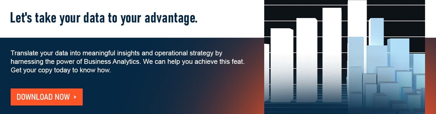
If you need help in organizing your business data and accounting information, D&V Philippines is here to help. Contact us today to get a free consultation from our experts. You may also download our latest whitepaper, The Rising Frontier: Harnessing the Power of Business Analytics, to learn how we can help you get the most out of your data.