Posted by Jan Victor Valencia
Aug 31, 2022
Share


What makes data visualization effective?
Good data visualization is accessible and inclusive. It means whomever your audiences are — whether they’re data literate or have visual deficiencies — can understand and act on the pieces of information you present.
To create user-friendly data visualizations, consider these best practices:
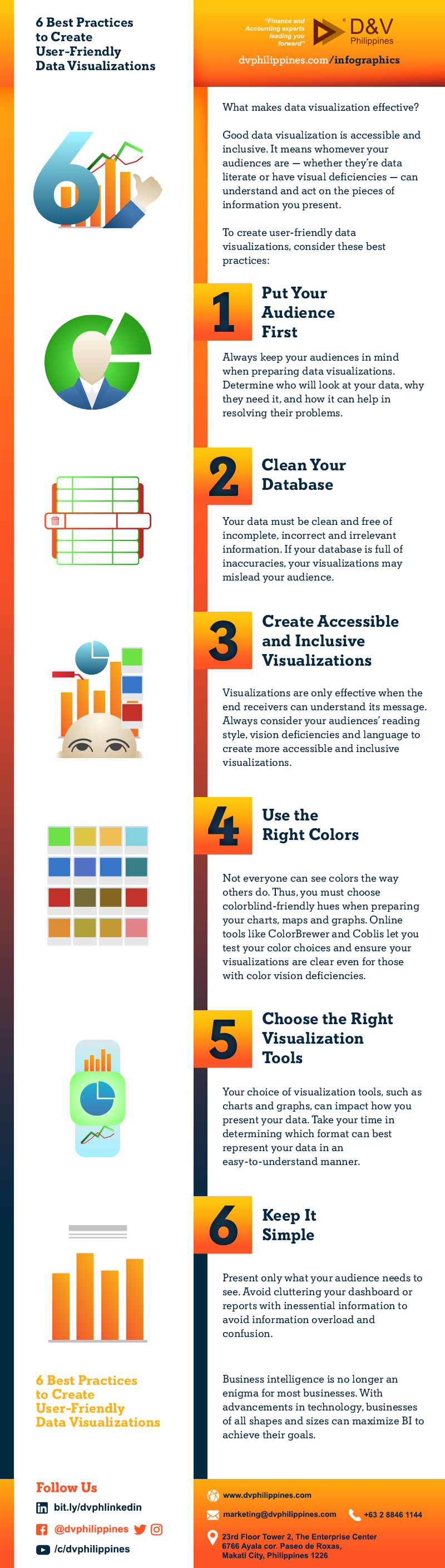
1. Put Your Audience First
Always keep your audiences in mind when preparing data visualizations. Determine who will look at your data, why they need it, and how it can help in resolving their problems.
2. Clean Your Database
Your data must be clean and free of incomplete, incorrect and irrelevant information. If your database is full of inaccuracies, your visualizations may mislead your audience.
3. Create Accessible and Inclusive Visualizations
Visualizations are only effective when the end receivers can understand its message. Always consider your audiences’ reading style, vision deficiencies and language to create more accessible and inclusive visualizations.
4. Use the Right Colors
Not everyone can see colors the way others do. Thus, you must choose colorblind-friendly hues when preparing your charts, maps and graphs. Online tools like ColorBrewer and Coblis let you test your color choices and ensure your visualizations are clear even for those with color vision deficiencies.
5. Choose the Right Visualization Tools
Your choice of visualization tools, such as charts and graphs, can impact how you present your data. Take your time in determining which format can best represent your data in an easy-to-understand manner.
6. Keep It Simple
Present only what your audience needs to see. Avoid cluttering your dashboard or reports with inessential information to avoid information overload and confusion.
Visualizing data makes complex information easier to understand. By following these data visualization tips, you can create user-friendly reports and dashboards to aid better business decisions.
If you need help in organizing your business data and accounting information, D&V Philippines is here to help. Contact us today to get a free consultation from our experts. You can also download our latest whitepaper, The Rising Frontier: Harnessing the Power of Business Analytics, to learn how we can help you get the most out of your data.